
Don't you want to read? Try listening to the article in audio mode 🎧
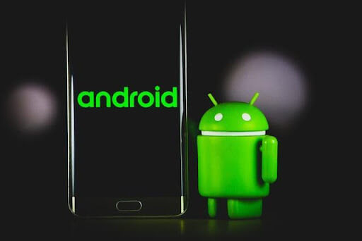
At present Android retains more than 70% of the global market share, so designing for Android is a skill that cannot be neglected. When you design for Android apps, you must know that you have one important constraint: your design (namely the way your app looks and behaves) should be consistent with the Android platform and its guidelines. There are quite strict design and quality guidelines to follow for your app to be accepted. Also, Android has some specificities with respect to iOS, that can be traced back to the differences in screen size (generally but not always Android phones are bigger and in any case there are much more screen sizes into the Android world than in the iOS one) and to the availability and function of buttons on the different devices (for example the presence or not of a “home” button) plus to many other aspects. The latest release of the Android design guidelines is named Material Design and represents a huge advancement in terms of appeal and emphasis on design.
Some flashes on Material Design
It’s no secret that designers generally prefer iOS over Android, because of some aspects that simplify their job (first of all less variety in devices and screen sizes) but also for the glam allure that is connected to Apple and its design. Material design is Google's answer to this dominance (and by the way it can be applied also to the iOS world). It’s inspired by the physical world and its textures but without the excesses in glossiness, 3D look and similarities to natural textures (like wood, rock…) that were quite common a few years ago. Also how the elements reflect light and cast shadows is accurately studied and represented, and great importance is given to the meaning provided by the motion of elements and how they transform the environment through their interactions and “behaviour”. In short, the “material” quality is given by how the various elements mimic without exactly reproducing the qualities of physical objects: shadows, light, depth, motion, reactions...according to material design philosophy digital objects that “exist” inside the device are not merely bi-dimensional but live and move in a space of their own according to rules that are not the exact reproduction of the rules of physics that govern the real world. Hierarchy, meaning and focus are obtained through print design methods — typography, grids, space, scale, color, and imagery. The interface should be meaningful but unobtrusive, to leave users to concentrate on actions and interactions. So an android app ui based on material design should be simple but not flat, choose a color combination that is pleasant but not excessively striking and fonts that are easy to read and help users to identify relevant information.Peculiarities of Android UX and UI design
True, material design can be applied also to iOS, but if you want to concentrate on Android ux or ui design there are some peculiarities that you should keep in mind. The first one we have already mentioned: the great fragmentation of the Android galaxy. The variety of Android devices brings with it an entire load of screen sizes and resolutions. The answer is to adopt an adaptive android design approach, with an extensive use of cards-style ui that fits particularly well in this approach. Also the navigation is typically different in Android devices and apps when compared to Apple ones. When designing your android app you should try to be consistent with what is generally accepted into the android universe and with its navigation patterns. Generally speaking, Android prefers the navigation drawer that comes in from the left side, activated by tapping on the so-called “hamburger icon”. You can also use tabs, but differently than in iOS they’re always at the top. Material design has also introduced the so called “FAB” button (Floating Action Button) which are big, round and eye-catching buttons usually located in the bottom right-hand corner of the screen. When tapped they trigger one action that the user performs regularly or in any case the action that is considered primary. In iOS instead primary action is usually on the upper right of the screen. But these are only the more macroscopic differences of course, there is an entire universe of differences, from the typos to the text styles, from the size and shape of icons to the tabs look and feel.Android UX and UI Tools and Software
And finally a quick parade of the main software and tools you can use to support and facilitate your android ux and ui design. First of all you should look thoroughly at the official Android Developers website which contains a comprehensive catalogue of resources, official guidelines, styles, icons, components, patterns and more. This resource is completely free, while the others we are about to list usually (but not always, check individual websites for further details on pricing) are free for individual use and have a fee for commercial use. So, let’s start with Mockuplus: it’s a prototyping tool for both Android and iOS, the big advantage is that it comes with pre-loaded elements (android status bar, bottom navigation bar, android switch, etc) that are already fully material design compliant. You also have an instant preview with 8 kinds of preview modes. Absolutely worth noting is also Sketch, which as a drawback comes only for MAC systems. Sketch is a vector design tool that basically offers the main UI and UX design functionalities that are available in Adobe Photoshop and Illustrator, but with a much simpler interface. It can also install plugins to expand its possibilities. Halas the preview function is not very effective, at least for the Android galaxy. Finally, there are two collaboration tools that you should take into consideration: Zeplin and iDoc. With both you can invite multiple team members to collaborate, import UI sketches and automatically generate specifications and other useful elements.
Article updated on: 09 August 2023
Subscribe to our newsletter
Subscribe to the newsletter to stay up-to-date on the latest digital industry news and trends
Keep reading
5
min read
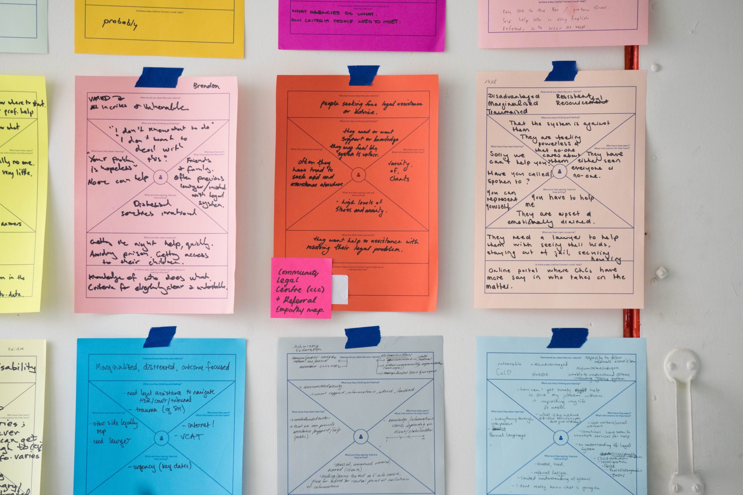
Design Thinking: how to design better services
Design Thinking is a planning model born in the 1960s. It is often linked to architectural design and areas in which ...
Talent Garden
06/05/2019

5
min read
Human-Centered Design Process: explanation and methodologies
Is it possible to design an interface, a user experience or a product from the concept of empathy? Is there a framework ...
Talent Garden
09/05/2022

4
min read
How to become a UI Designer: interview with James Reeve
How to become a UI Designer? Learning from the best. That’s why we interview James Reeve, Creative Director of ...
Talent Garden
06/12/2019
4
min read
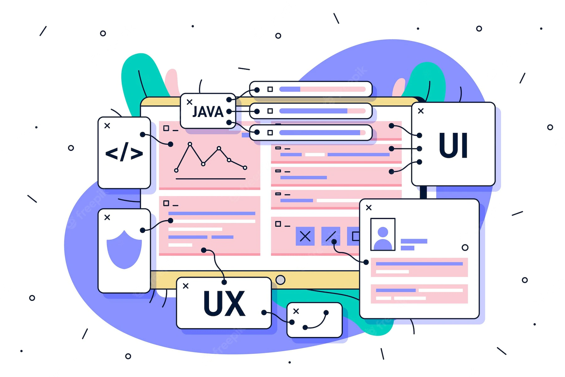
Atomic Design: what it is and why it is important in UI
The definition “design system” indicates a set of specifications that allow the creation of consistent user interfaces ...
Talent Garden
10/03/2022
Don't Waste Your Talent. Turn It Into a Career With a Course That Fits Your Needs!
Talent Garden is your Digital Skills Academy, offering courses in Digital Marketing, UX Design, Digital HR and Data Analysis designed to launch your career.
