
Don't you want to read? Try listening to the article in audio mode 🎧
Digital Marketing measurement and reporting have changed dramatically in the last two decades. Greater complexity in marketing strategies has allowed the evolution of measurement and advertising tools, in order to increasingly help marketers in measuring, better understanding their users and creating KPIs that reflect their real business.
Data Studio is a critical component for data collection, reduction, and visualization in an increasingly complex process. Discover a step-by-step introduction to using Data Studio and creating dashboards that support your digital marketing strategies.
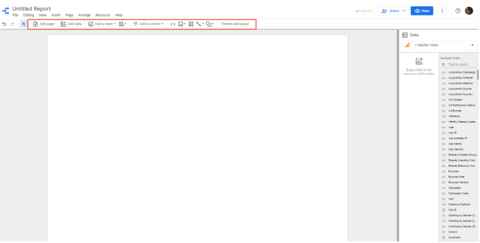 The main features within the Report Page are the following:


Why is data visualization so important?
The human brain has dozens of regions related to visual perception: densely interconnected groups of neurons devoted to the processing and filtering of information that we collect through our eyes. Evolution designed us in a way that no other activity demands more mental resources than visual perception and cognition. Alberto Cairo – The Functional Art Data visualization is the graphic representation of information which, thanks to visual elements, allows an easy reading of information. The greater usability of data thanks to visualization is given by the way our brain naturally processes visual inputs. Just think that:- 90% of the information is nonverbal;
- 70% of our receptors are inside the eyes;
- 50% of our neurons are involved in processing visual information.
What is Google Data Studio
Data Studio is the Google data visualization tool that allows you to create dashboards by aggregating and reprocessing data from your main digital platforms (Google Analytics, Google Ads, YouTube, Google Sheets, Facebook).Main features and strengths
Data Studio is the perfect platform for 6 main reasons:- It is free: the only conditions for accessing Data Studio are: having a Google account, being a resident of one of the 180 countries in which it is supported, including Italy.
- It is very intuitive and easy to use: the product was designed with the aim of creating a report as quickly and easily as possible.
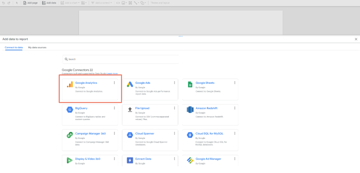
- it has a wide range of data sources to which to connect to create your own report. There are 22 data sources developed directly by the Google team that can be integrated with Data Studio (e.g.: Google Analytics, Google Ads, Google Sheets, Google Search Console, Google BigQuery, YouTube Analytics). Moreover, thanks to the power of the community, hundreds of third-party connectors have been developed to choose from to associate different vendors not present within the Google connectors (e.g.: Facebook Ads, Facebook Insights, Instagram Insights, Pinterest etc.).
- It is dynamic: the reports have interactive features that allow the management of time intervals and customizable filters according to the integrated data source.
- It is shareable: the report can be shared via a link, exported as a PDF or sent automatically at time intervals.
- It is a vibrant and constantly updated platform: new features are very frequent and always documented.
Practical guide to create a report
Homepage
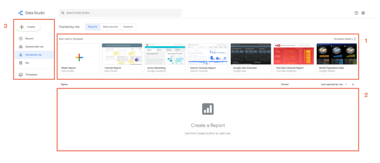
Creating a report with Data Studio is really simple! Follow the steps to start building your first dashboard with a real-time data update. First, open Data Studio with an account logged into Google. You will find the platform’s Homepage which consists of three main sections:
- Template gallery: you can create a report from scratch or use one of the templates already created by the Google team and designed for different platforms (Google Analytics, Google Ads, YouTube, etc.).
- List of recent reports: Below the templates you will find an empty space which, as you create your reports, will be populated with all the most recent dashboards you have created or used.
- Subdivision of reports divided by properties: on the left you will find a menu to navigate your reports based on whether they are the most recent, owned by you, or they have been shared with you. Furthermore, you will have access to the reports moved to the Bin.


Report page
At this point we are inside the Report page and we are ready to create our first dashboard. The main features within the Report Page are the following:
- Add a page: you can add one or more pages to your report to make it more comprehensive and available. Get all the information related to the report navigation feature.
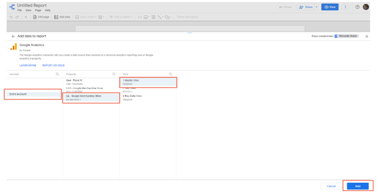
- Add a source: you can add one or more sources to your report, in addition to the one you originally chose (in our case Google Analytics). In this way, you can enter data from multiple data sources within the same pages quickly and easily.
- Add a chart: this option allows you to add different types of charts, the main ones are:
- Table
- Pivot
- Scorecard
- Time Series and Line Chart
- Bar chart
- Pie Chart
- Area Chart
- Add a control: the control features allow you to interact with data in the following ways:
- Filter the information on the basis of sizes you set;
- Set time intervals;
- Change the underlying dataset used by a data source.
- Theme and Layout: You can customize the colors, style and layout (such as height or width) of the dashboard.
Add your first chart
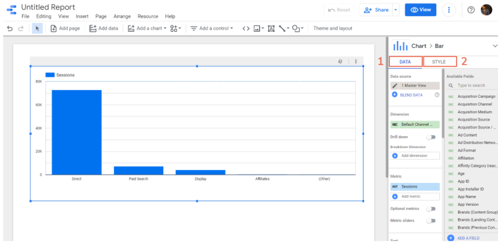
To create the report, simply select a chart and place it within the report. Then selecting the newly created graph we will have two options:- Data: menu that allows you to modify the data of the selected graph. For example, if you want to change/add a dimension or a metric or insert a filter for the single chart in such a way as to display only a portion of the data.

- Style: includes all the options related to the graphic treatment. For example, you can change colors, insert labels, and modify axes ranges.
Edit and View Mode
Inside the Report Page, on the top right, there is a blue button that will allow any user who has the permission to edit the report to be able to switch from View Mode to Edit Mode.- The Edit Mode allows us to modify the report in every aspect: eliminating, editing and adding elements, data and information on the basis of requests.
- The View Mode is how the dashboard will appear to the end user; in this mode, however, it is not possible to edit the report except thanks to the controls that will allow a temporary change on the graphs and on the date for the purpose of conducting analysis.

Report Sharing
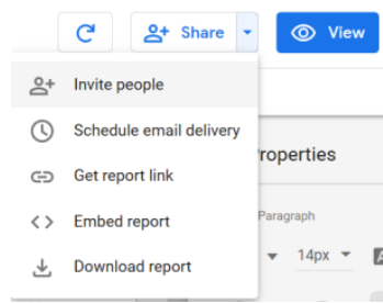
The great power of Data Studio also lies in its ease of sharing. In fact, you can share and view all the possibilities for sharing your report by clicking the arrow to the right of the 'Share' button, present in each Data Studio dashboard.
Invite people
By selecting the 'Invite people' option, when the pop-up appears, you will have the opportunity to add any Google account with the permission to edit the report or just view it. Furthermore, within the 'Manage access' option, you will also have the possibility to copy the dashboard link and check its sharing: from only those who have access to the dashboard up to anyone with access to the Internet.
Automated email scheduling
Scheduling the sending of an email allows you to automate the sending of links to reports on a daily, weekly, monthly or customizable level. When an email is sent, it includes a link to the original report along with an attached PDF. Also, since Data Studio doesn't have perfect mobile viewing yet, a PDF is the perfect compromise between utility on mobile and desktop.Embed
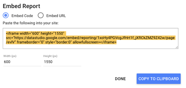
You can also display your report on a website, which can be a great way to highlight the results you have achieved for a client or project.
Download the report
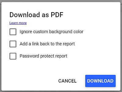
Alternatively, you can download your report in PDF format. This is useful for one-off situations, such as if your boss asks you for a progress report or your client wants to know how an ad has performed up to this month. To download the file, click on "download" in the drop-down menu. Data Studio offers the option to download the current page or the entire report. You can also add a link to the report so your audience can dig deeper into data if they want, and add password protection to ensure your data remains safe.
Conclusion
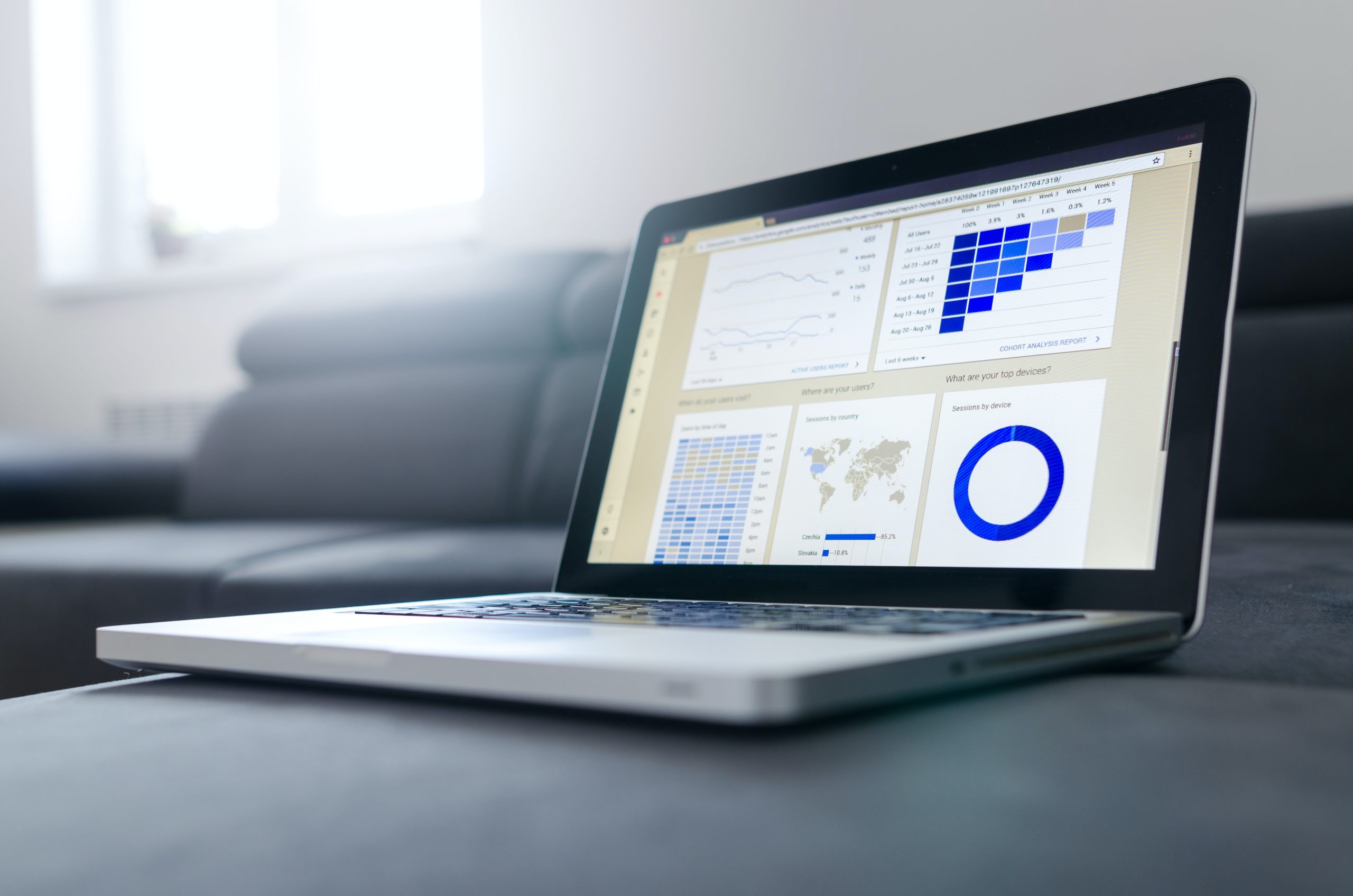
Now that you know all about Data Studio, you are prepared to create fantastic interactive reports for your colleagues, clients and supervisors. Use this guide to get the most of your dashboards and take your analytics to the next level. Photo by Lukas Blazek on Unsplash
Article updated on: 09 August 2023
Subscribe to our newsletter
Subscribe to the newsletter to stay up-to-date on the latest digital industry news and trends
Keep reading

3
min read
Google Certified Digital Marketing - Is It Really Worth It?
In the era of digitalisation, marketing has undoubtedly moved to online channels. The adoption and awareness of online ...
Talent Garden
25/10/2021

11
min read
12 AI-Powered Marketing Tools to Revolutionise Your Strategies in 2024
Are you ready to enter the exciting world of AI-powered marketing? It is a place where innovation and efficiency ...
Talent Garden
12/09/2023

3
min read
5 Reasons You Need a Digital Marketing Strategy
If you are a publisher or a retailer you know you need to do some digital marketing campaigns to thrive, especially ...
Talent Garden
07/07/2021

4
min read
Don't Pause, Bid Down: Finding Value in Search During Coronavirus
Donutz Digital is a digital marketing agency who specialise in Marketing performance. They optimize marketing manager’s ...
Talent Garden
15/05/2020

Don't Waste Your Talent. Turn It Into a Career With a Course That Fits Your Needs!
Talent Garden is your Digital Skills Academy, offering courses in Digital Marketing, UX Design, Digital HR and Data Analysis designed to launch your career.
